
Looking to give your garden a facelift this summer? Jinny Blom reveals her top painting tips on how to give your backyard an easy-to-implement glow-up
With the evenings brighter and the weather warming up, many homeowners are looking to refresh their outdoor space.
British landscape architect Jinny Blom, who recently released a collection of plant-based paint colours, in partnership with luxury paint manufacturer Mylands, has some simple solutions that will make subtle but impactful changes to the way you see your exterior.
Play with compatible colour combinations to refresh existing timber furniture
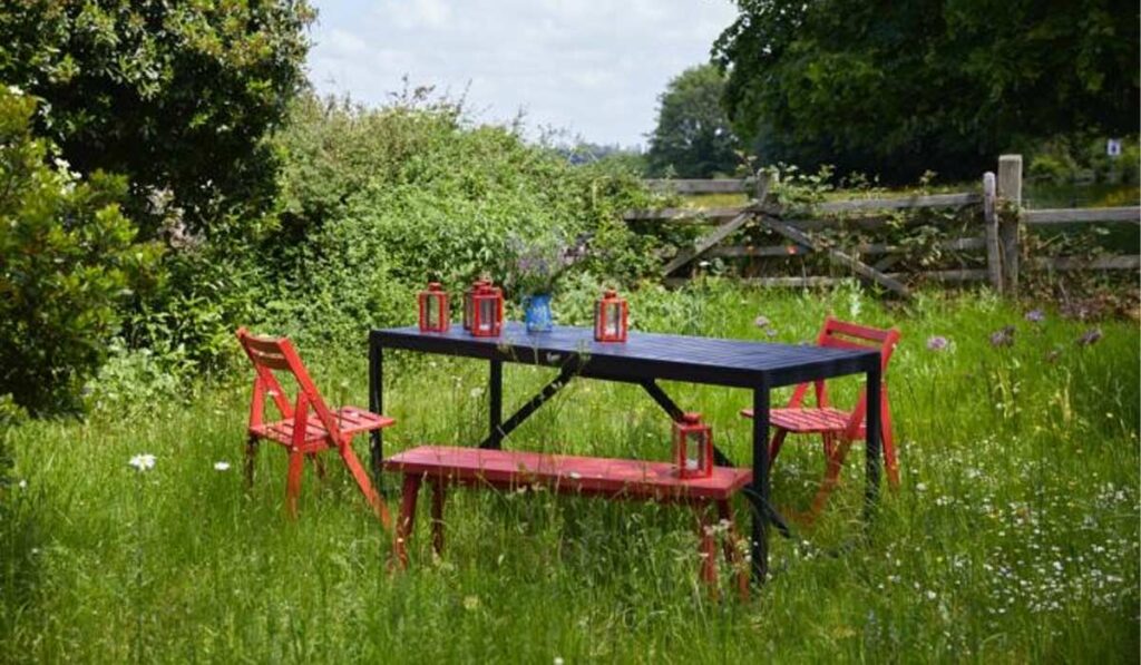
If you have garden furniture that has weathered to grey, and not in a good way, you can breathe new life into it with compatible colour combinations.
If a wild flower garden that already features lots of lush green, opt for a bold blend such as Woodnight, as seen on the table, and Blomster, on the bench seating, chairs and lanterns.
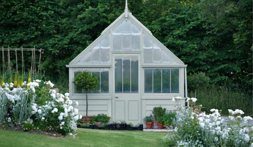
Mid-tones harmonise garden buildings and facades with natural surroundings
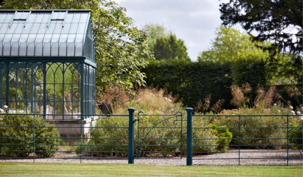
Jinny's work with landscapes demonstrates her innate understanding of how colour behaves and performs outside.
She believes colour schemes can be unique to everyone's gardens, but is drawn to shades that are inspired by nature.
Shades like Murmeration, a rich, deep midnight blue, that behaves like the sudden flash of a starling wing in flight, on railings, sits quietly alongside Riverine, a muddy blue, akin to the soft ground that covers salt marsh and estuaries.
Seen here above, on the greenhouse, it demonstrates how choosing mid-tones when using colour outside helps harmonise garden buildings and facades with their natural surroundings.
Use bold accent colours to highlight elements within the space
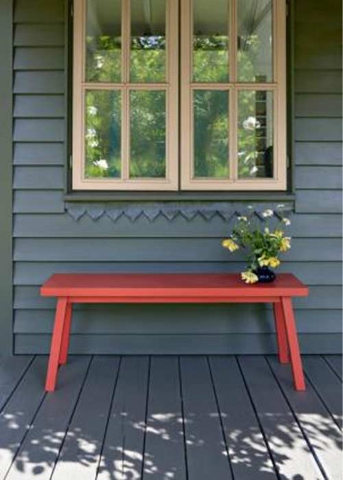
Ginny believes the "unexpected red" theory, used by interior designers to help pull a room together, works in gardens just as it does inside, with a painted bench adding a wonderful pop of colour that adds visual interest.
Blomster serves the purpose beautifully.
Explaining her process behind the colour, Jinny said that it was a faded chair outside a house that she recalled when mixing this colour.
"It is amazing how our memories store things we like," she remarked.
"I love it in a landscape setting, either as an accent or as a whole building. It's a wonderful spark of life."
Not all neutrals need to be bright white
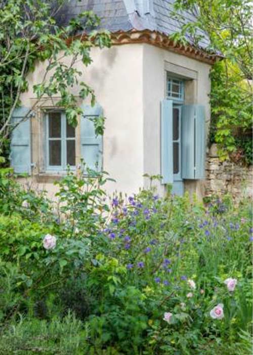
If you're planning to paint around your garden, Jinny contends that a harsh white will wash out any colourful plants you may have. As a result, you should opt for a pale shade that is "similar" but different to white.
"White is almost always a mistake when used in a garden," Jinny explains.
"Try taking a photo of your favourite area, and you’ll see how uncomfortably dominant white paint can be."
Opting instead for colours that she says "read as white," Jinny has developed five alternative options that are all relatively neutral in tone, although some read as dark on colour cards.
They are Grail, a gritty pale grey; Rain, a delicate blue; Haar, a granite grey; Sprig, a fresh green; Sargasso, a soft pigeon grey, and Cooper's Earth, a mink pink, saying that the latter is her colour of choice.
"Cooper's Earth is the best replacement for white on masonry," she explains.
"I use it all the time now, it's a real paint and not just a colour in my imagination. This warm, chalky hue complements foliage and masonry without dominating."
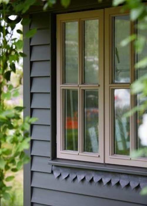
Highlight architecture with timeless colour tones
Architectural details, such as gates and railings, can be overlooked.
Recently developing the aforementioned Murmuration, she says that the deep blue hue resembles the early "smalt' of crushed cobalt and quartz, melted into ornamental gates from the 15th to 18th century".
She also recommends softer, weathered-looking shades such as Grail, which she describes as "a spitty, gritty, pale grey [that] is the perfect foil colour to stronger hues".
Both provide definition and interest, without competing with the natural world.
It's your outdoor space. Make it your own
While designing gardens for her clients, Jinny says that she wants them to be personal, explaining: "I want them to feel like their garden belongs to them, rather than foisting my ‘signature’ on them.
"I get a great deal of pleasure from giving them that."

She says that choosing which tones resonate with your own sensibility will ensure that the outdoor space is authentically yours.
"Take risks," she counsels. 'If someone tells you something is impossible, see if you can do it. Gardening is invariably a knife-edge between disaster and serendipity."
Mylands Ginny Blom collection is available from Stillorgan Decor