The joy of rich colour, fine Italian Barolo wine and some of a client's favourite things helped interior designer Collette Ward create an ambient mood that showcases her new paint collection.
Pics: Ruth Maria
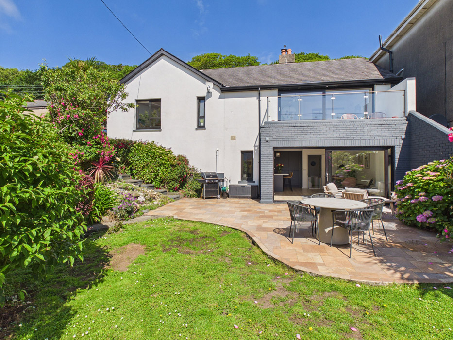
It was a joy, says Collette Ward of her recently completed new build project in the Midlands.
Through her eponymous design firm Collette Ward Interiors she uses the three-letter word a lot when describing the large four-bedroom house in Mullingar that demonstrates her innate ability to mix colour, pattern and textures throughout.

In terms of the colour, it really is just instinct, she says. “I can stand in a space and know what’s right, for a client, for a job. A house dictates.”
“She loved the process. She said ‘yes’ to everything I suggested," Ward says. This is rare.

Getting to know the client is crucial, Ward says.
“I look at the person standing in front of me, how someone dresses, and how playful they are. It is so important to have things that resonate with her. Emma loves colour, art, print and textures.
"Her favourite colour is really important to know. She loves blue.”
And all kinds of blue are worked into the scheme.

You can see answers to her queries on walls, worktops, ceilings and underfoot.
There is a blue-hued onyx tile from Tilestyle used on floors and walls in the downstairs bathroom, where there is a bottle trap sink.
It features in the terrazzo-look tiles in the kitchen and on the base of the island.

There are hints of it in the wallpaper in the dining area, and it is used to create an after-dark ambience in the downstairs bedroom.
She shifted parts of the original floor plans to create a better flow, most evident in the open plan kitchen. “The seating area is now the dining area. It’s closer to the island. It’s more practical,” she explains.
Longford-based Kestrel Kitchens were as enthusiastic as the client. To every ‘can you do this query, the answer was yes, she recalls.
By mixing the materials, pale wood cabinetry, some blocked in a soft white, and colour, in this case Iron Blue, on the base of the island, one of 34 shades in Ward’s collection for Kraftsmann. “It suited its corrugated reeding,” she explains. The seating here is Vincent Sheppard’s Joe counter stools.

Emma had wanted to line the interior of the larder cum coffee dock with a tile, but “we used wallpaper instead that came in at a fraction of the price,” Ward explains.
“If a client really wants something, we find another way to get that effect.”
The paper is Graphite by Belgian wallcoverings OMexco.

There are mid-century touches throughout, drawing reference without being too slavish.
In the dining area, she leaned into the shape of the dining table and chairs, all custom-made by Ward.
On the wall behind is Treetops.
A paper by Harlequin that offers movement and distraction, and two to three shades of blue and terracotta.
The vase atop the table is flowers, and a vase by Joeanna Caffrey Flowers.

There is a lounge area too, screened from the rest of the room by a glazed panel that creates a break from the open space.
“It creates a little bit of cosiness, that isn’t in the flight path of traffic through the room where you can burrow in with a cup of tea and a book.”
There’s even a ledge on the screen.
The custom sofa has rectangular block legs and bolster-look arms designed to let light come under and over it. Underfoot is a zodiac rug from Rugs.ie

The paint collection very much reflects Ward’s confidence with colour.
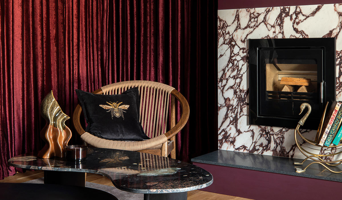
In the living room, colour drenches the walls and ceiling while paying homage to Ward’s client and her favourite tipple from Piedmont.
It is called Emma’s Barolo after Italy’s most noble wine.

There’s another custom-made sofa here made to maximise seating without overfilling the room, and a piece by artist Petria Lenehan hangs on the wall.

“I wanted to bring in her elements of playfulness, so we wrapped the wall, sloping ceiling, joinery and curtains in that colour,” Ward explains.
The room also features another Vincent Sherpard seat, Norma, an outdoor chair that can be used indoors in winter and moved outdoors in the spring. She likes pieces that multitask.
A focal point of a fireplace, framed in marble.

In the hall, she changed the staircase.
It had spindles, and she plastered it out to make it look slightly more European.
On the wall opposite is a Casamance wall panel and a pair of blue 1960s Italian 1960s chairs from Acquired.ie
What you get throughout is a balance of colour and texture that looks immaculate.
To book a consultation, visit Collette Ward Interiors. To find out more about Collette Ward’s paint collaboration with Kraftmann click here.