Playing around the edges, mismatching furniture and fabrics, Nicola Harding creates the sense that a place has evolved organically over time, which is where enchantment comes in.
The reason grey became so omnipresent in our homes was that it was an easy way to apply a trend, like switching a not-so-flattering photograph to black and white mode.
Everything looks more flattering in monochrome.
Using colour successfully is much more difficult, as anyone who has tried out lots of sample pots already knows.
Rooms that have different aspects and receive different amounts of light affect how the colour looks on surfaces.

“Colour shapes mood, creates atmosphere and, at its very best, nurtures the soul. It is a very nuanced thing,” she says.
“Colour is something felt as much as it is seen, both in the clothes we wear and the homes we live in.
"We choose shades that suit our colourings, and palettes that work with the bones and natural light of an interior.”
With interior design, always consider the colour palette, she counsels. It is not as easy to change as your wardrobe.

“A colour on its own is one thing, but when used in combination, they are magic spells. Layered in specific ways, they have the power to heighten the good and quieten the less good.”
Recognised for her impressive use of colour, London-based designer Nicola Harding’s youth has helped form her innate sense of home.

“Having moved around a lot as a child, I have always been interested in creating interiors that evoke a sense of belonging.
"It’s about giving people a sense of place. Achieving that peculiar alchemy that makes a house someone’s home. We want to create places rich in soulfulness and atmosphere."
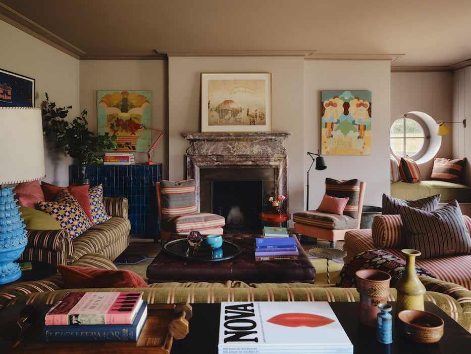
Her pairings look as if they’ve been in situ for decades, and that is critical to the success of her schemes.
She loves dusty shades of purple when you can’t quite tell where it sits between blush, brown and blue.
“Those in between, hard-to-define colours are always the best, when we can’t quite place them, they draw us in, prick our interest.
"The dusty mauves are restful and a beautiful foil to so many other colours, especially the myriads of greens we see in nature.”

Walls in Post Modern Mauve, shelving in Aubergine, both by Pure & Original
As a look, it doesn’t feel done. This undone effect is exactly what her clientele wants.
They can claim it as their own. It appears so fitting and natural as if to belie the expertise that went into its creation.
It also conveys warmth, the antithesis of grey. Yes, she uses scatter cushions, but there isn’t a karate chop in sight.

Balancing classicism and rule-breaking is what she likes doing best.
“Classicism makes us feel grounded, but then it’s about playing around the edges, which is where enchantment comes in.
"Mismatched layering of furniture and fabrics, the sense that a place has evolved organically over time, rather than having been overly designed, is what makes a house a home. It feels lived in."
One of her favourite collaborators is the Irish polymath Patrick Kinmouth, who often references Irish architecture and craftsmanship, and we draw inspiration from his references into our work together, she says of the architectural and interior designer, opera director, stage and costume designer, who started his professional life as arts editor at Vogue.
"Most recently, we talked about gloss-painted, boarded ceilings."

Texture and pattern exist in the very bones of a room, beyond the realms of fabric and wallpaper.
The aged patina of an antique table, the cool sheen of reflective metal, the quiet softness of worn linen – each has its own presence, but their greatest power lies in how they are placed in relation to one another, she explains.
"A rough, timeworn surface sings when set against something sleek and new; the ornate detailing of the past is given new life when placed beside the crisp lines of the present."
All of this is visible in her renovated 17th-century Cotswolds home, which she shares with her husband Andy, their kids, and a menagerie of cats and dogs.
In it is a kitchen by Plain English, where the walls are painted in a green fresco finish, Sea Moss by Pure & Original.

She is also mindful of sourcing products from sustainable sources. She considers how they are made and how they will stand the test of time. We also may inherit pieces, she says.
This is how it is in real life.

She suggests you keep "these treasures".
She believes they can take on a new life when rearranged in different corners of the house. She also buys pieces at antique fairs and from dealers to help create a mix of old and new.
In her house, she took 1960s pink textured tiles from the downstairs cloakroom and found a happy resting place for them in the upstairs family bathroom, where the form the bath splashback.

The house also features in her new coffee table book, Nicola Harding Homing Instinct, by luxe publisher Rizzoli New York and demonstrates her colour confidence in various other projects.
If in London, you can soak up her style at the Beaverbrook Town House in historic Chelsea or in the Peak District, you can enjoy her big-house-inspired décor at The Cavendish Hotel in Baslow.
Nearby is Chatsworth Hall, which appeared in various screen adaptations of Jane Austen's Pride & Prejudice and Chatsworth’s art, history and people helped inspire its look.
“We sourced incredible pieces from upholsterers, craftspeople and makers, such as locally woven organic cotton and linen fabrics and glazed ceramic bedside lamps made by a member of the Chatsworth team.”
For more visit Nicola Harding and Rizzoli